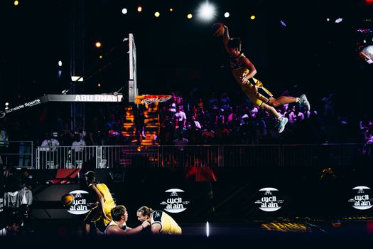
The NBA is a league of stories—on the court, in the stands, and even stitched into the very fabric of its teams’ identities. But while buzzer-beaters and championship dynasties grab the headlines, another story unfolds quietly on every jersey, scoreboard, and highlight reel: the evolution of NBA logos. These emblems are more than just artistic flourishes—they are symbols of cities, eras, and cultures, each crafted with intention and steeped in meaning. Let’s journey behind the design and discover the fascinating world of NBA logos, from their historical roots to their modern-day reinventions.
The Origins and Evolution of NBA Logos
When the NBA was formed in 1946 (then called the Basketball Association of America), team logos were rudimentary compared to today’s sleek designs. Early logos like the Minneapolis Lakers’ simple blue-and-gold basketball or the Boston Celtics’ original leprechaun were functional and direct, meant to be easily recognizable on grainy black-and-white TV screens and in newspaper box scores.
The league itself adopted its now-iconic logo in 1969, featuring the silhouette of Jerry West dribbling—a design by Alan Siegel. Inspired by Major League Baseball’s logo, Siegel’s vision was to create a timeless mark that captured the essence of basketball in motion. Today, the NBA logo is recognized by 97% of American sports fans and has remained unchanged for over five decades, a testament to its enduring appeal.
.png)
Over the years, individual team logos evolved alongside advances in graphic design and changes in branding philosophy. The 1990s saw a wave of bold, cartoonish logos—think Toronto Raptors’ dribbling dinosaur and Vancouver Grizzlies’ fierce bear—reflecting a surge of youth-oriented marketing. In the 2010s, the trend shifted toward minimalist, retro-inspired looks, as franchises sought to honor their histories while appealing to global audiences.
The Art and Science Behind NBA Logo Design
Designing a logo for an NBA team is no trivial task. Teams invest hundreds of thousands of dollars and consult with top-tier design agencies. The process often spans months or even years, involving input from owners, marketing teams, players, and fans.
Key considerations include:
- $1: Teams select colors that evoke the spirit of their city or region. The Miami Heat’s fiery red and black echo the city’s vibrant nightlife, while the Boston Celtics’ green ties back to Boston’s Irish heritage. - $1: The logo must incorporate elements representative of the team’s name, city, or local culture. The Denver Nuggets’ mountain peak, for example, nods to Colorado’s geography. - $1: Logos must be simple enough to be recognizable at any size—from a courtside banner to a smartphone app icon. - $1: Designers balance contemporary appeal with lasting relevance, hoping to avoid the pitfalls of dated fonts or fleeting graphic fads.Research shows that effective sports logos can enhance merchandise sales by up to 15% and boost fan engagement both online and at live events. As a result, teams are highly strategic in their branding decisions, often unveiling new logos alongside major roster changes or arena renovations to signal a fresh chapter.
Case Studies: Stories Behind Iconic NBA Logos
The journey behind each NBA logo is as unique as the teams themselves. Here are three standout examples:
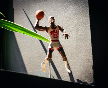
- $1: The Lakers’ famous purple-and-gold logo, featuring a basketball with motion lines, was designed in 1960 after the team relocated from Minneapolis. The colors symbolize royalty and excellence, while the motion lines evoke the team’s fast-paced "Showtime" era. - $1: Created by designer Ted Drake in 1966, the Bulls’ red, black, and white logo features a fierce, forward-facing bull. Remarkably, the logo has never been changed—making it one of the longest-lasting in sports. Its aggressive stance and blood-tipped horns were intended to intimidate opponents and energize fans. - $1: When the Nets moved from New Jersey to Brooklyn in 2012, they unveiled a stark black-and-white shield logo. Designed by rapper and entrepreneur Jay-Z, the minimalist design was inspired by New York City subway signage and reflected Brooklyn’s urban grit and cool.Each of these logos not only represents the team but also tells a visual story about the city, the era, and the brand.
NBA Logo Changes: Trends, Timelines, and Impact
Logo redesigns are major events in the NBA world. They can spark excitement—or controversy—among fan bases, and often reflect larger shifts in a team’s strategy or culture. Since 1980, more than 20 NBA teams have significantly updated their primary logos.
A few key trends and statistics:
- Between 2010 and 2024, 12 NBA teams unveiled new or refreshed logos—a higher rate than any previous decade. - Teams often time logo launches with new arena openings, uniform redesigns, or to mark milestones such as anniversaries. - The most dramatic rebrands (such as the Charlotte Hornets reclaiming their original name and teal-and-purple palette in 2014) saw a spike in merchandise sales of over 30% in the following season.Here’s a comparative table showing some notable NBA logo changes and their outcomes:
| Team | Logo Change Year | Old Logo Style | New Logo Style | Impact/Result |
|---|---|---|---|---|
| Brooklyn Nets | 2012 | Red, blue, basketball and shield | Minimalist black and white shield | +21% merchandise sales |
| Charlotte Hornets | 2014 | Bobcat (orange/blue, aggressive) | Retro teal/purple hornet | +30% merchandise sales |
| Golden State Warriors | 2010 | Muscular warrior figure | Golden Gate Bridge icon | Embraced Bay Area identity, record jersey sales |
| Milwaukee Bucks | 2015 | Cartoon deer with basketball | Modernized, angular buck head | Praised for sophistication, new era branding |
Globalization and the NBA Logo
The NBA’s transformation into a global sports juggernaut has influenced how teams design and update their logos. Modern NBA logos must resonate not only with local fans but also with international audiences in China, Europe, Africa, and beyond.
- In 2023, NBA international viewership topped 2.8 billion across TV and streaming platforms. - Teams like the Houston Rockets, whose name and red color scheme appeal to Chinese fans, have enjoyed significant merchandise sales in Asia. - The league’s “City Edition” uniforms and alternate logos often incorporate local languages, symbols, and colors, further expanding their reach.The NBA also collaborates with global designers, such as Nike and Jordan Brand, to ensure logos adapt well across a range of merchandise, from classic jerseys to streetwear and digital avatars in video games.
The Future of NBA Logos: Digital Age and Fan Involvement
As technology reshapes how fans interact with the NBA, logos are evolving to meet new demands. In 2024, over 65% of NBA fans reported following games and teams primarily through digital platforms. Logos must be instantly recognizable not only on TV but also as app icons, emojis, AR filters, and in the metaverse.
Recent trends include:
- $1: Some teams solicit fan feedback on logo concepts via social media polls and forums. - $1: Logos are being designed in scalable, vector formats to ensure they look sharp on any screen. - $1: Teams roll out secondary or “event” logos for special occasions, playoff runs, or commemorative anniversaries.With the rise of NFTs and digital collectibles, NBA teams are exploring animated logos or limited-edition digital badges, further blurring the lines between traditional branding and interactive fan experiences.
Why NBA Logos Matter: Identity, Culture, and Beyond
NBA logos are much more than branding—they are cultural artifacts that carry stories, traditions, and aspirations. They unite generations of fans, spark debates, and serve as rallying points for civic pride. Whether stitched on a jersey, painted on a mural, or flashed on a smartphone, these symbols encapsulate the unique blend of history, artistry, and passion that defines the NBA.
As teams and fans look to the future, one thing is clear: behind every great NBA moment, there’s a logo with a story all its own.